Kacper Sidło — website
Logo, visual identity and a website for a filmmaker and gaffer: a K monogram, the navy and black of a film set, a cinematic opening and a portfolio of productions. Everything from scratch — KICKASS.
Visit websiteA brand from scratch — with a logo that shines
Kacper Sidło is a filmmaker, camera operator, director and gaffer with seven years of experience. He has worked on commercials, documentaries and promotional films for big brands, and in his work he combines a photographer's eye with light that builds mood. He needed a personal brand that says at first glance: “I know images.”
We did everything: the logo, the visual identity and the website.
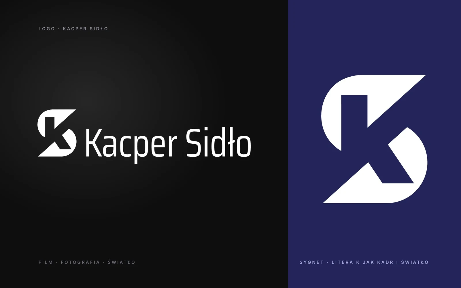
A monogram like a frame and a beam of light
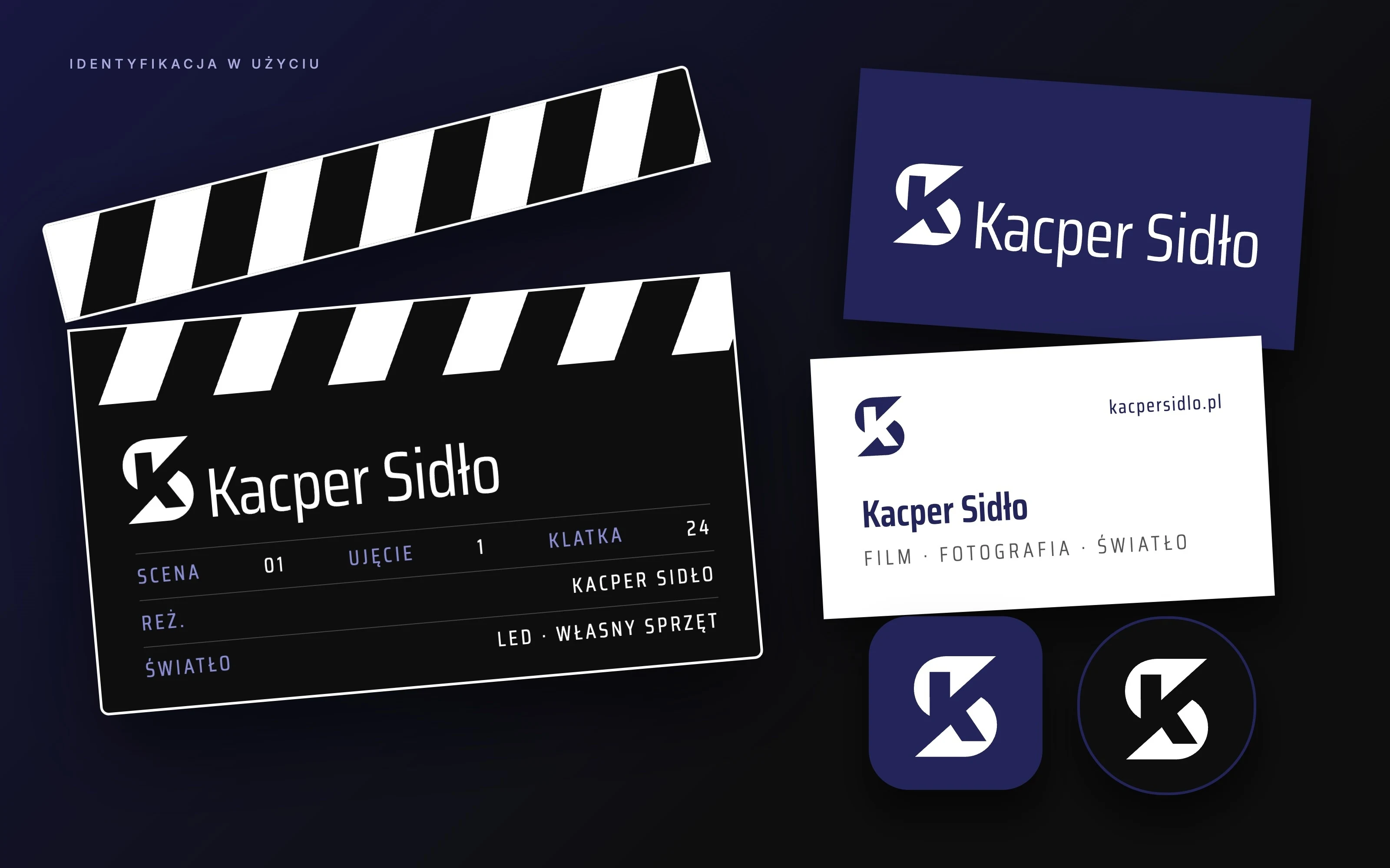
The letter K enclosed in a single, dynamic mark: the cut edges recall a film frame and the bright diagonal a beam of light from the set. The monogram works on its own — as an icon, an avatar or a mark on materials — and alongside the name in a narrow, modern typeface that reads well both on a poster and on a phone screen.
Navy and the black of a film set
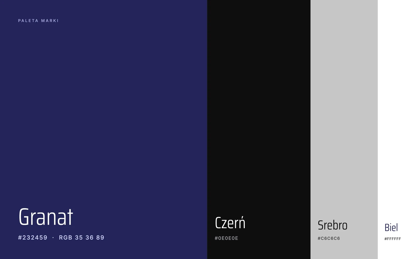
The palette is as simple as a well-lit frame. Black is the dark set and the cinema, navy gives the brand its own recognisable colour, and silver and white give it room to breathe. That keeps Kacper's photos and films in the foreground, not decoration.
Typography
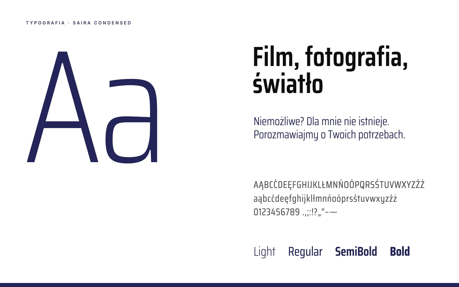
Everything is built on the Saira Condensed typeface — narrow, technical and elegant. Light weights give headings airiness, semi-bold ones build strong slogans, and Polish characters look as good in it as the Latin letters.
An identity ready for the set and the screen
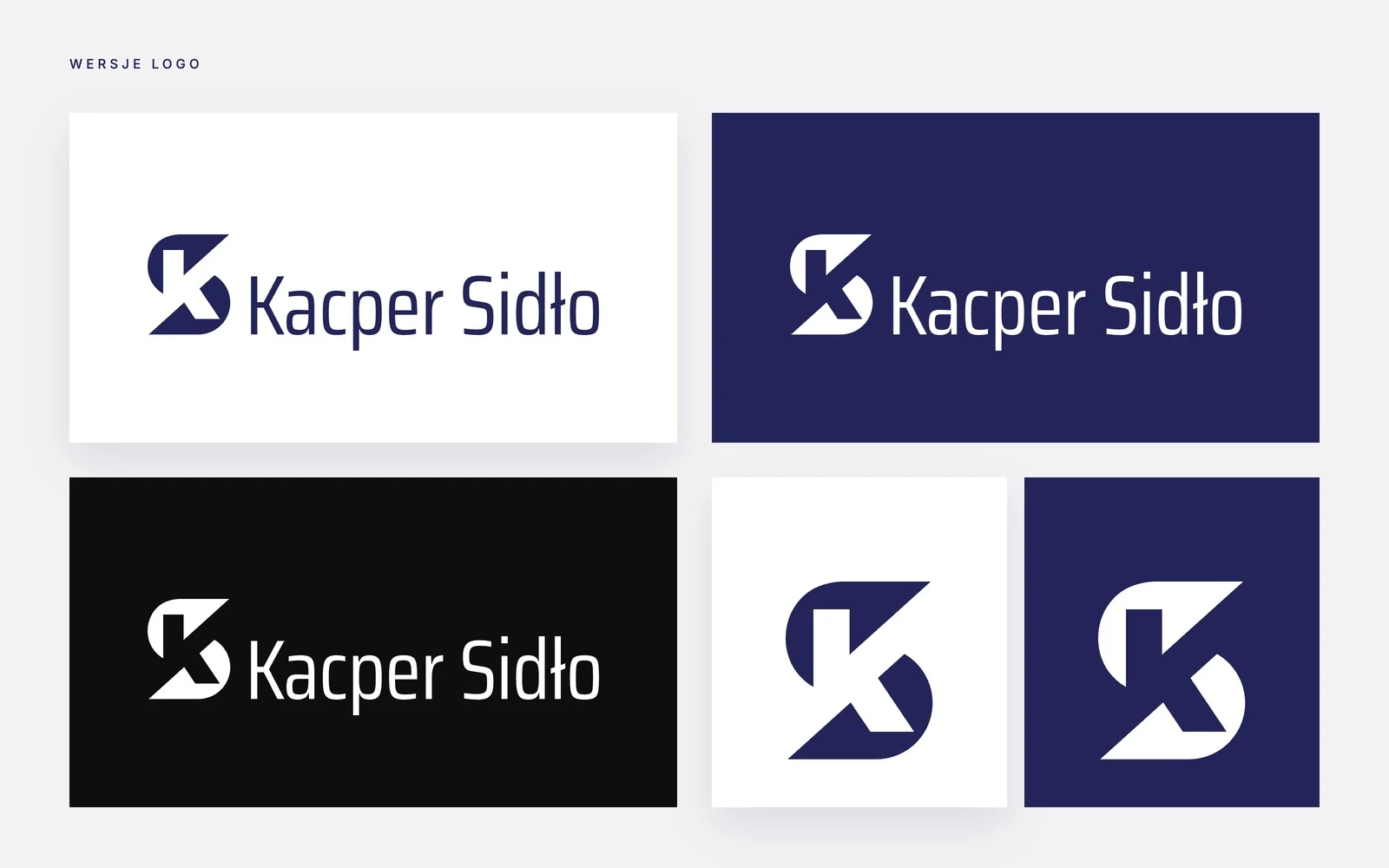
From the start the brand was meant to work where Kacper works: on a clapperboard, a business card, a profile icon and in his videos. The logo has versions for light and dark backgrounds and a stand-alone monogram, so it looks consistent everywhere.
A website that shows the light
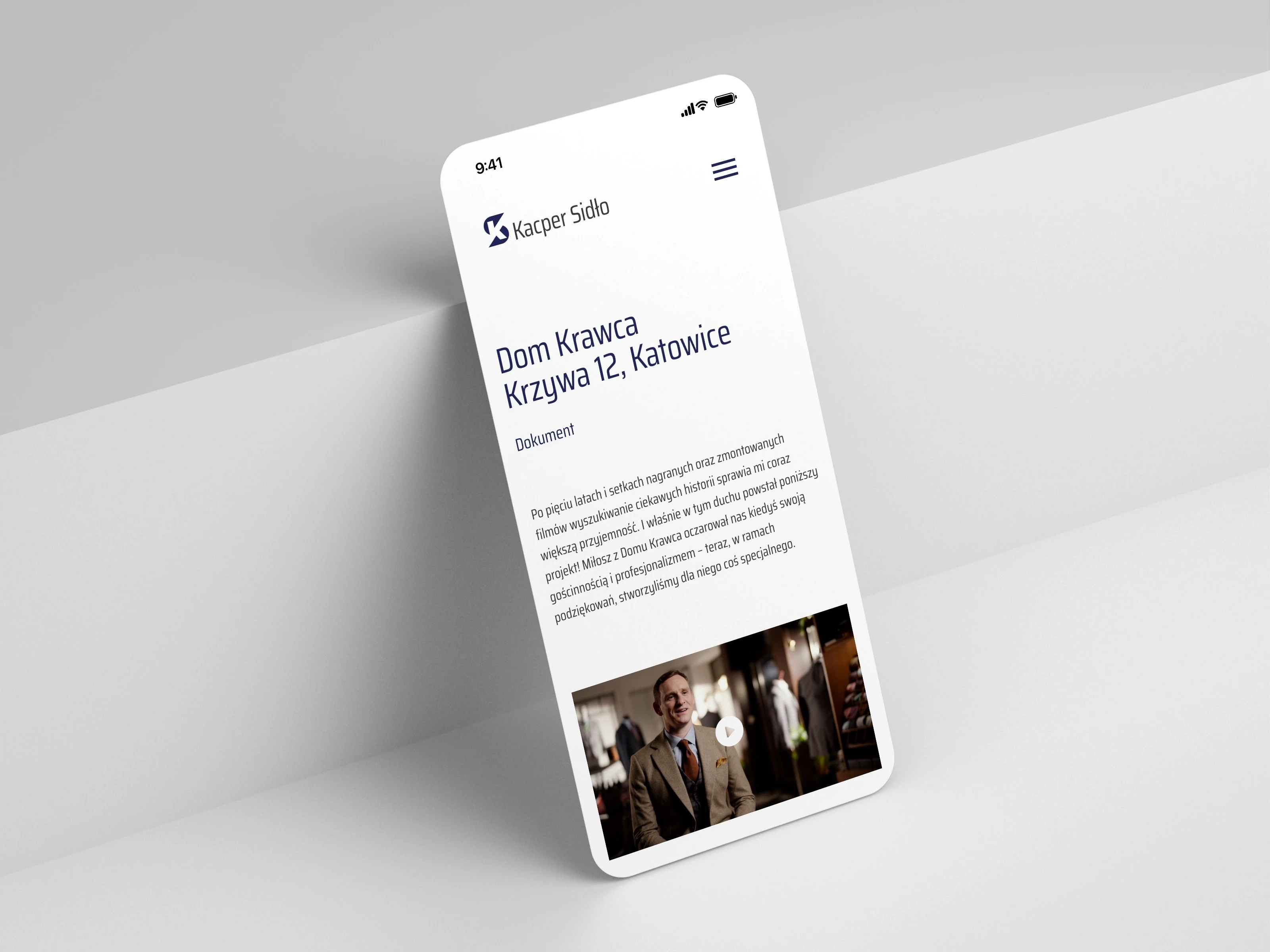
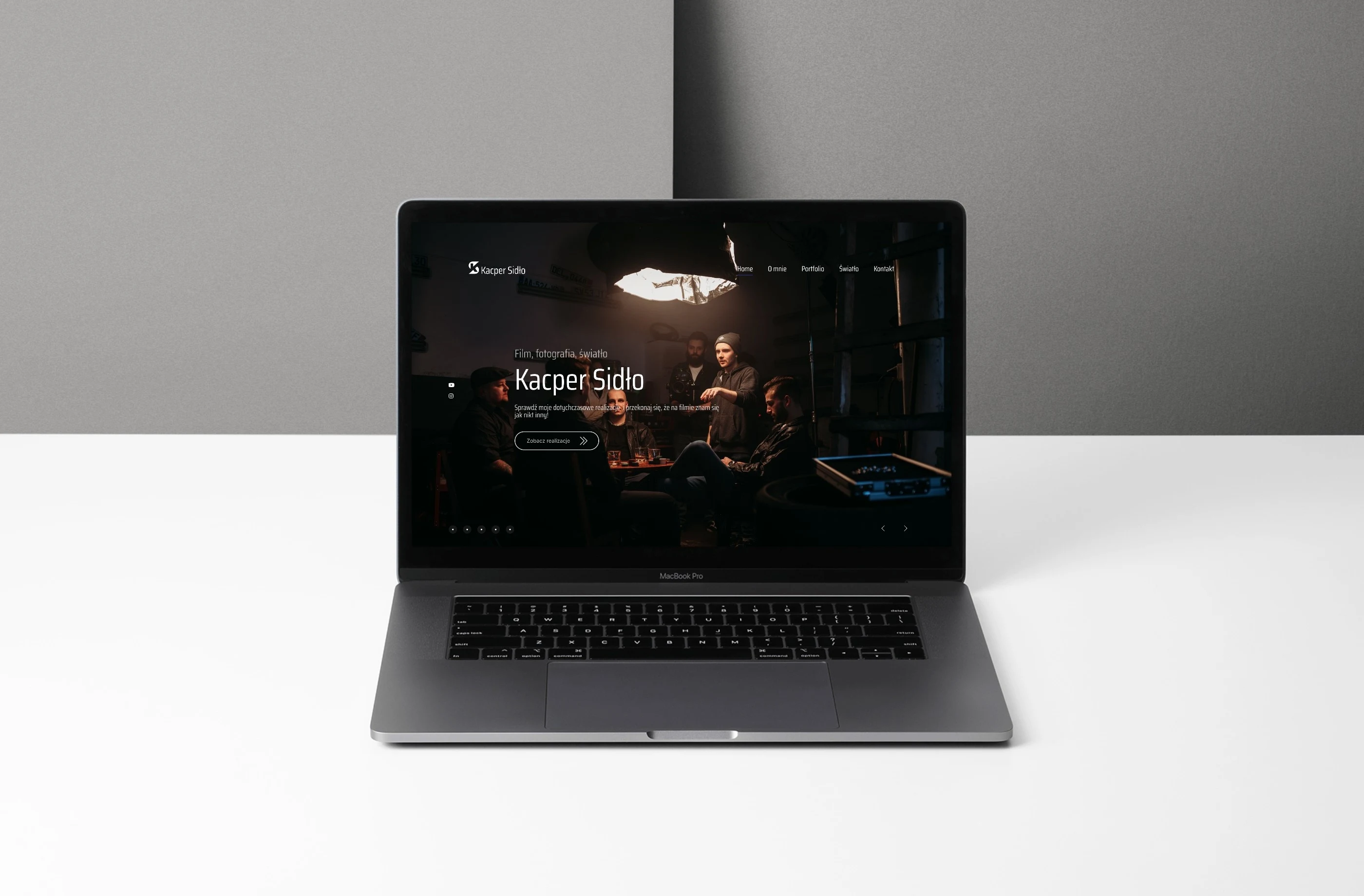
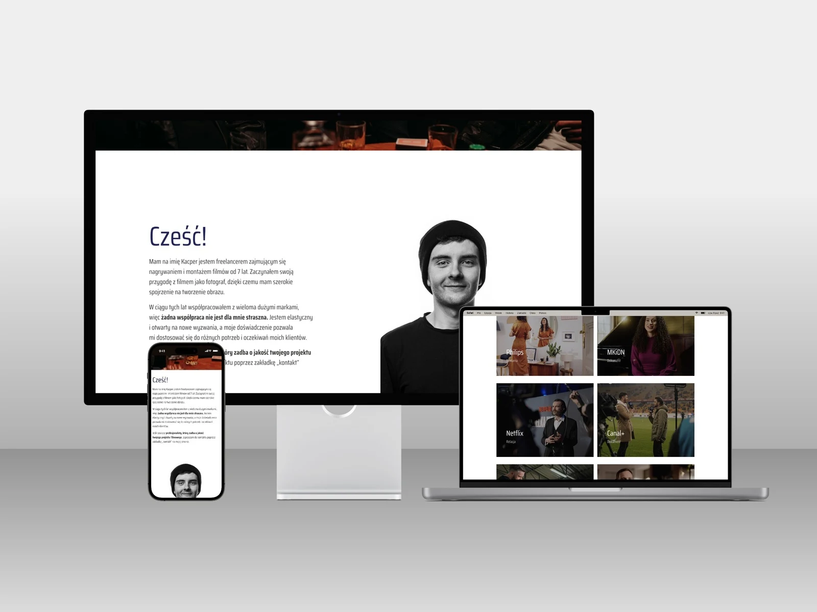
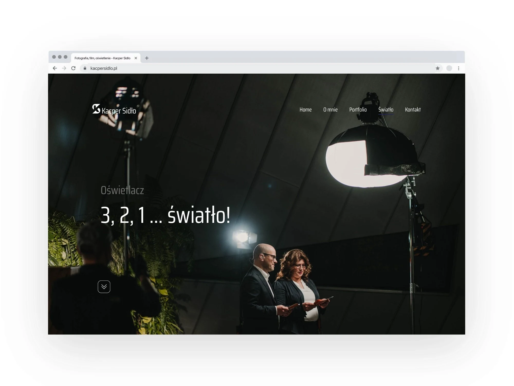
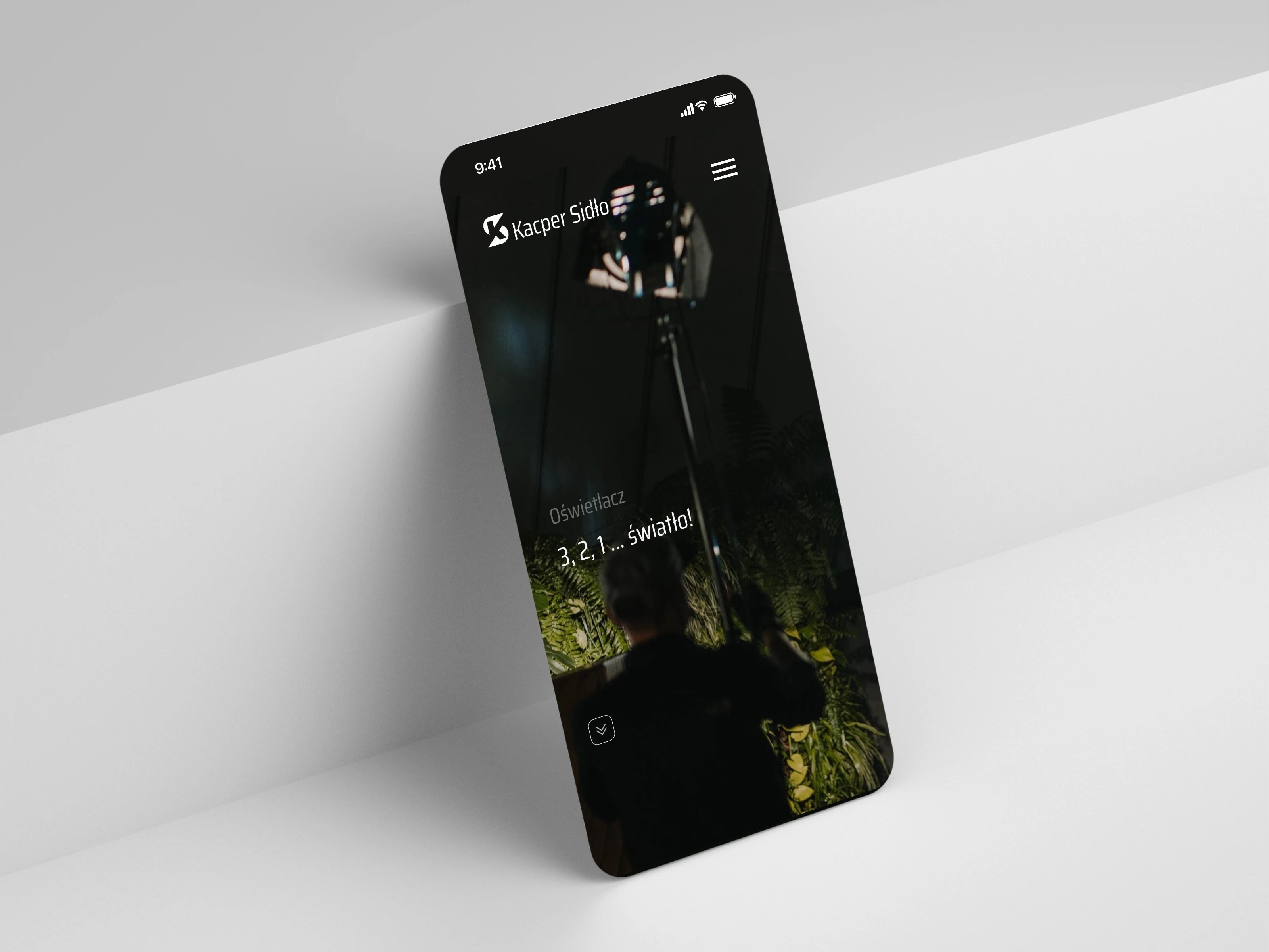
The kacpersidlo.pl website opens with a full-screen frame from a film set and the slogan “Film, photography, light”. The dark, cinematic start contrasts with light text sections, and the “See the productions” button leads visitors straight to what matters most to clients: Kacper's work.
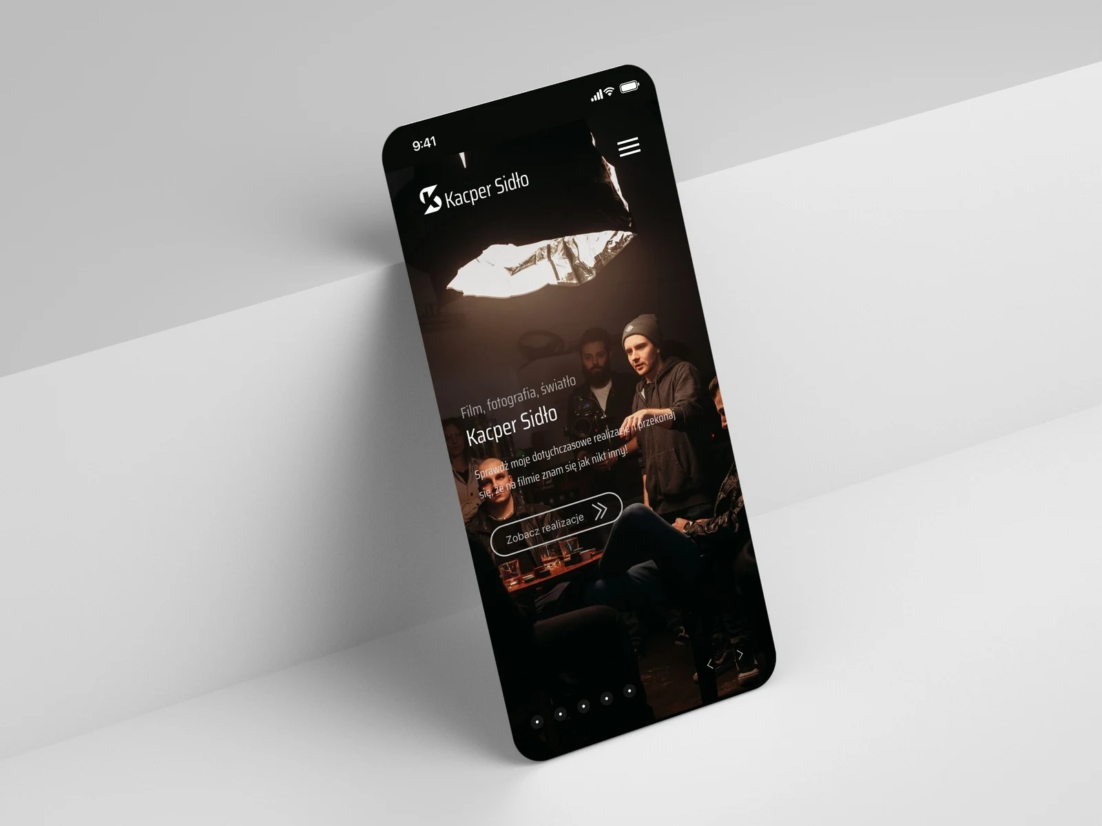
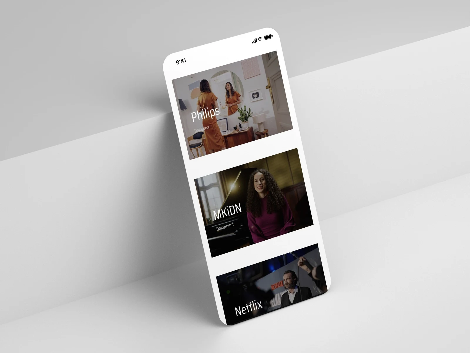
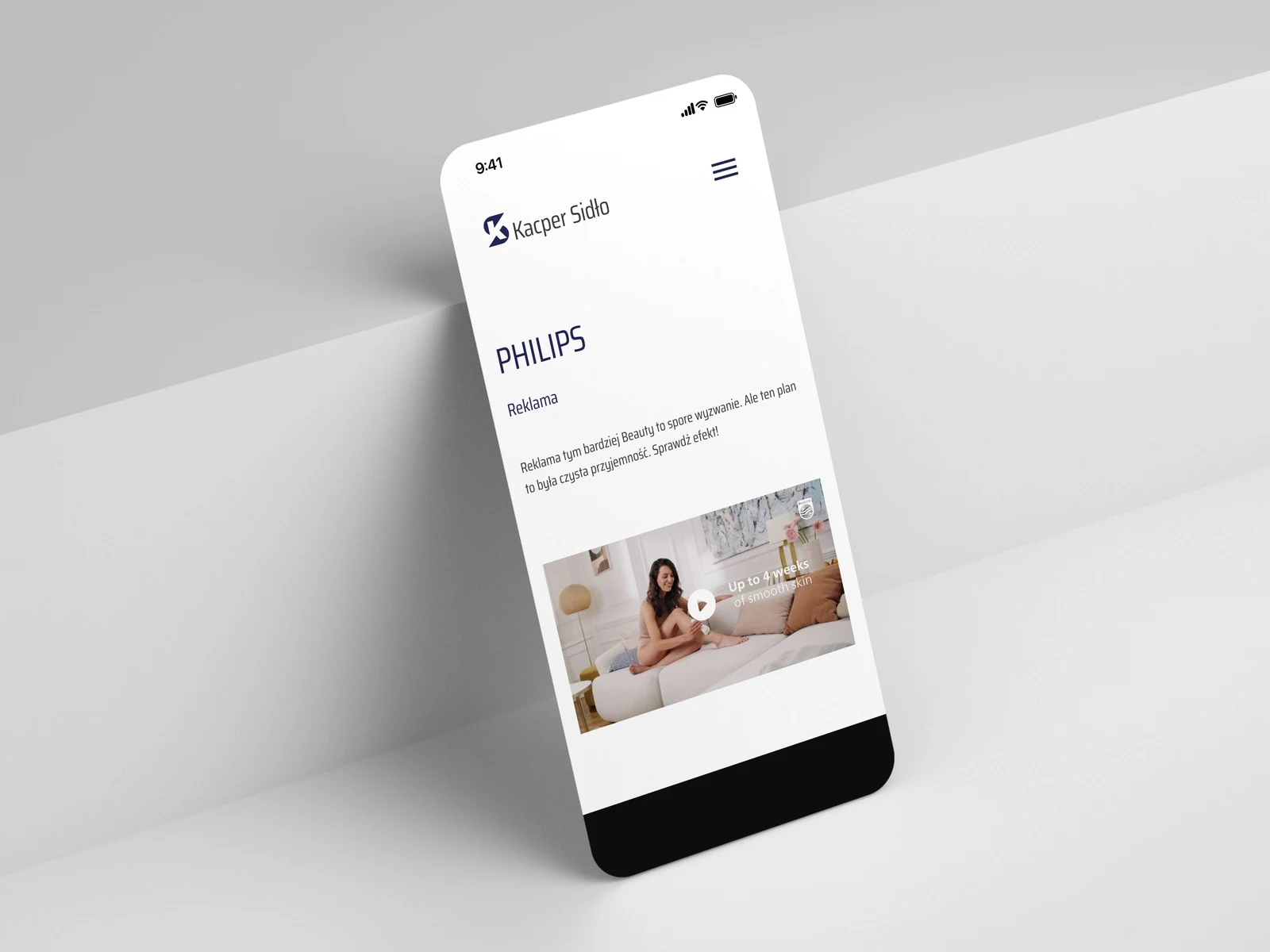
Everything is adapted to computers and phones — frames stack vertically and the menu folds into a handy button.
A portfolio that convinces from the first frame
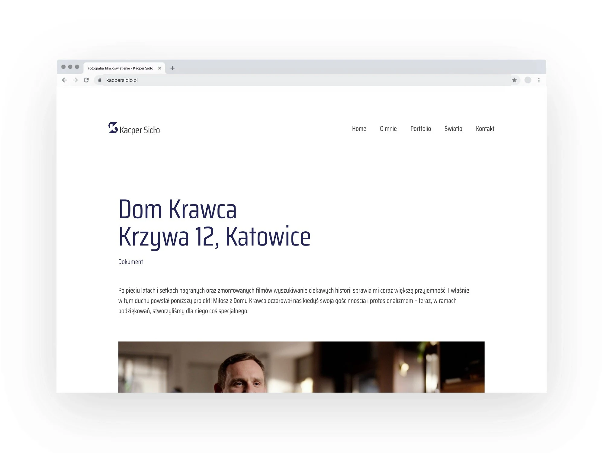
Productions — commercials, documentaries, promotional films and case studies — are laid out as tiles with a frame, a title and the type of production. In a few seconds a client sees what Kacper does and for whom.
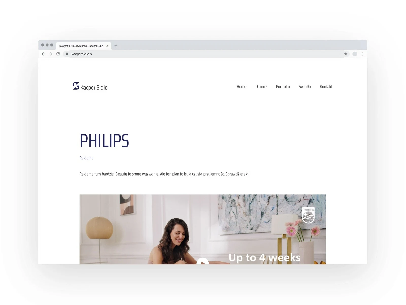
Each production has its own subpage with a film, a short description and a breakdown of roles: “What was I responsible for on this project?” and “Meet the full team”. It shows the scope of work openly and builds trust.
About me and light
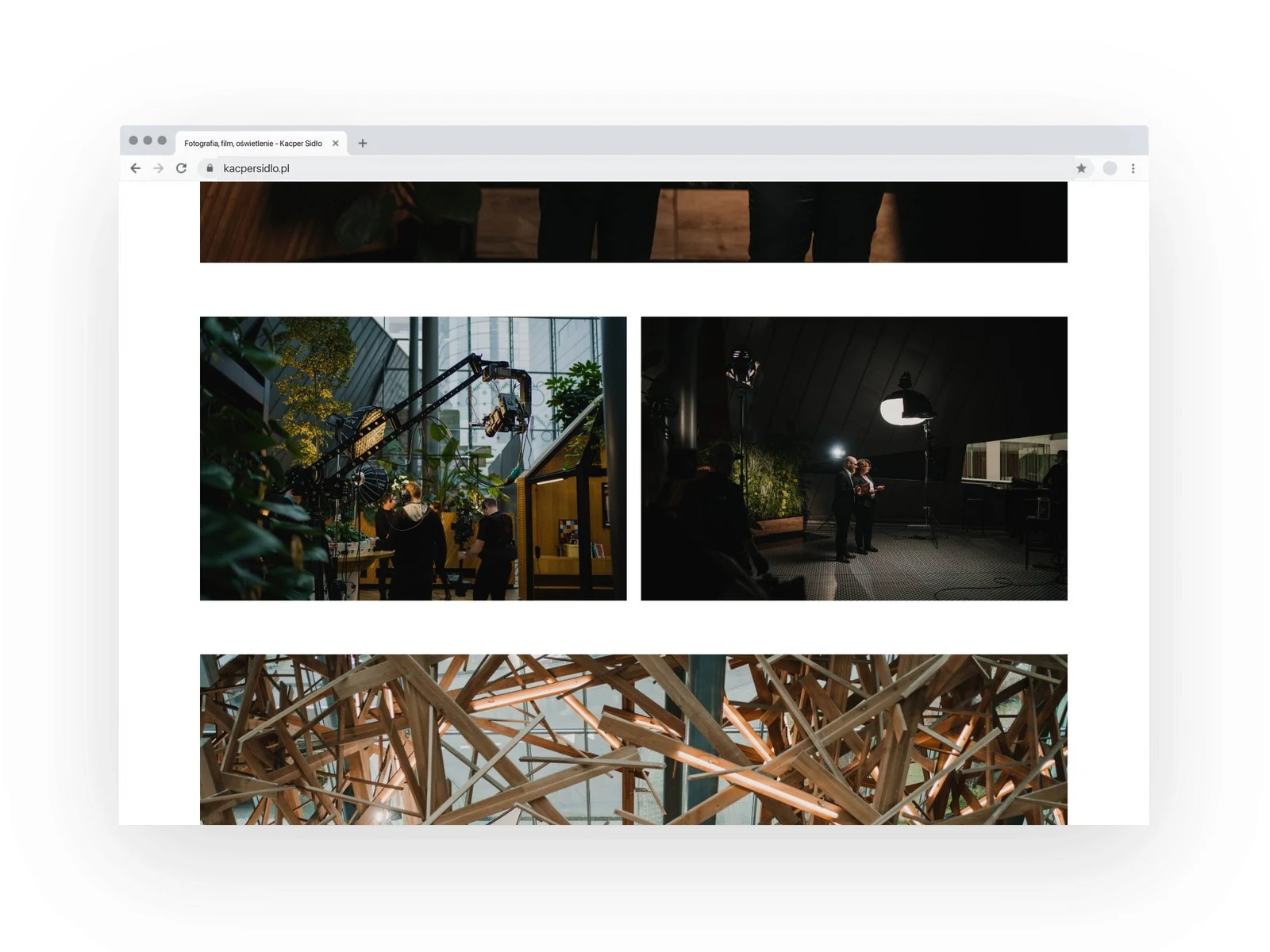
The “About me” subpage introduces Kacper and three areas of his work: film creation, lighting and film production. A separate “Light” subpage tells about the work of a gaffer, with a film and a case study of a large production — so a service that is hard to describe in words is shown through examples.
Easy contact
Every subpage carries the invitation “Let's talk about your needs!”, a phone number, an e-mail address and links to YouTube and Instagram, so it is one step from watching to talking.
Scope of work
- Logo and monogram, versions for light and dark backgrounds
- Visual identity: colour palette, typography, examples of use
- Graphic design and UX/UI of the website — computer and phone
- Portfolio layout: production tiles and subpages with a film, a description and a breakdown of roles
- “About me”, “Light” and contact subpages
- Website implementation and launch